
You spend twenty minutes on an application. You click Submit. Nothing happens. You click again.
Did the first one go through? Did you just send it twice?
Good error handling starts the moment someone clicks Submit. Show that you got their request, keep what they entered, and if something goes wrong, tell them what they can safely do next.
Design the Wait
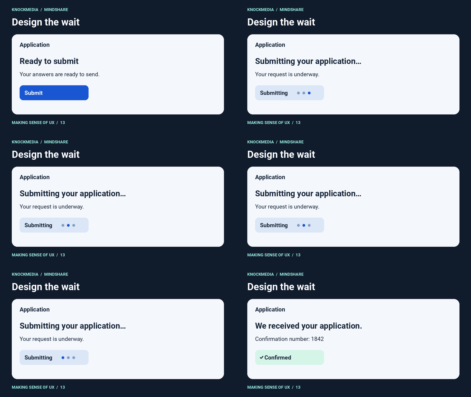
Start by acknowledging the click. “Submitting your application…” tells people the request is underway and gives them a reason to wait.
For a longer task, give people whatever progress you can reliably show. “Uploading your file (72% complete)” is helpful when you can measure the upload. If you’re waiting for another service to respond, say what’s happening and whether the person needs to keep the page open.
Put the Error Where People Can Fix It
You fill out a long form, click Submit and see “There were errors with your submission.”
Great. Where?
If the phone number is missing an area code, put “Enter a phone number with an area code” next to that field.
Keep what people entered so they can fix the errors without starting over. On a longer form with several errors, give people a summary that links to each field. Check that people using a keyboard or screen reader can find the message and get to the field it describes.
You can prevent some of these errors before people get to Submit. Show an example next to the field so people can still see it while they type. If an upload only accepts PDFs, put that information next to the upload button. Say what you mean, where you mean it.
Give People a Way Back
Back to the application. You clicked Submit and your connection dropped. What should the page say when you reconnect? That depends on what the system knows.
- Submission confirmed. “We received your application. Your confirmation number is 1842.”
- Submission failed and the draft was saved. “Your application wasn’t submitted. We saved your answers. Try again.”
- Outcome unknown. “We couldn’t confirm whether your application went through. Check your application status before submitting again.”
That last example needs more than a line of copy. Where can someone check the status? What happens if they click Submit twice? Work through those questions with your developers and QA team. If the interface offers a retry, the system should handle it without creating a second application.
Recovery matters when the system works exactly as designed, too. Think sending that email or deleting the wrong file from a project. If the action is reversible, show “Undo Send” or “File moved to Trash” with an Undo button. Give people a way to restore it from Trash after the message disappears.
Let People Pick Up Where They Left Off
Imagine getting all the way through checkout. You’ve added your items, entered your shipping address and clicked Pay. Your card is declined. DO NOT MAKE THIS PERSON START OVER. Keep their cart and shipping details right where they are.
Put the message next to the payment details. “Your card was declined. Your cart and shipping details are saved. Try another payment method.” Keep the “Your cart” panel visible and show “No order placed” so shoppers know where they stand. Give them a “Use a different card” button next to the error.
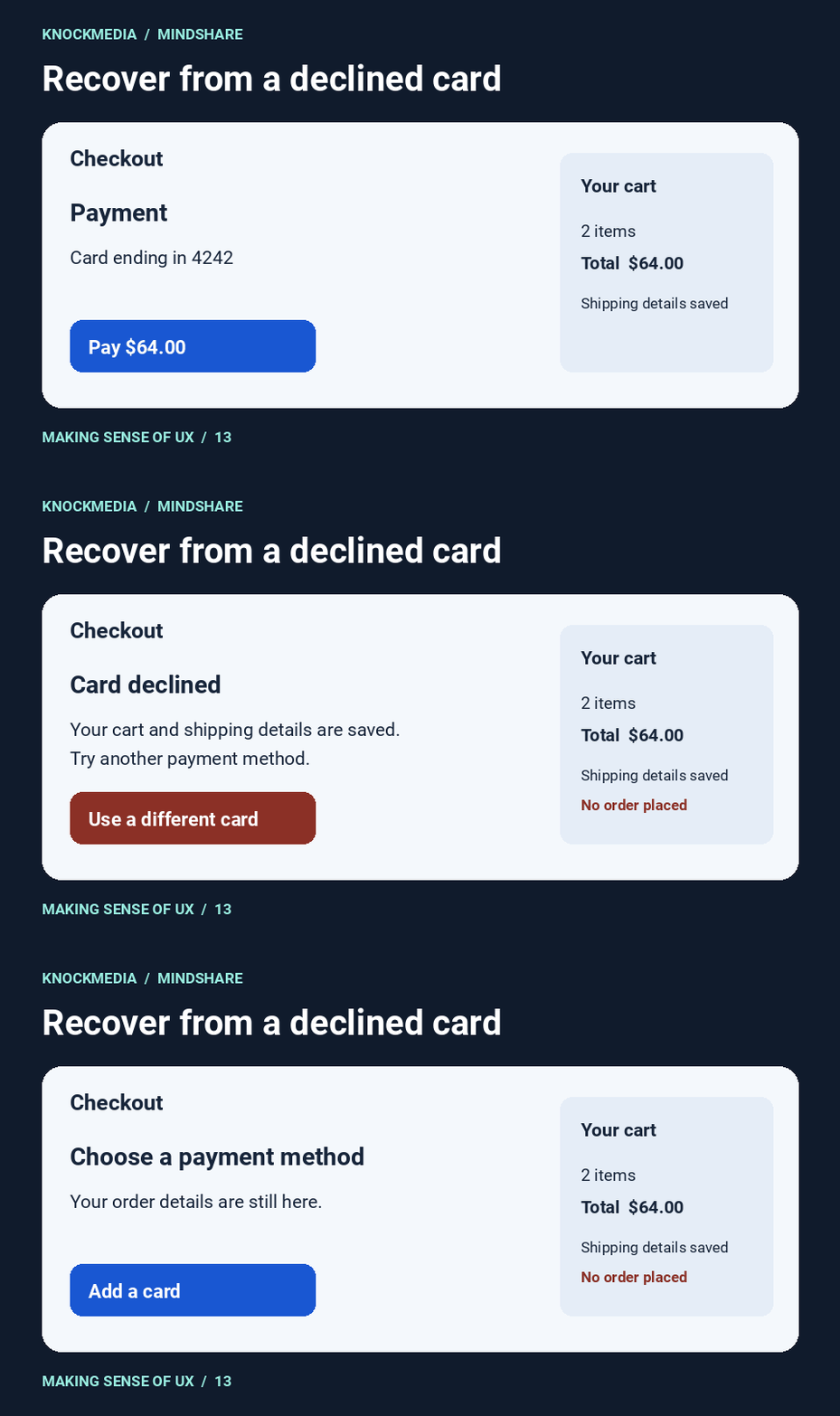
If the payment was declined, let the shopper change how they pay right there. If the connection dropped and you can’t confirm the outcome, give them a way to check their order status before asking them to pay again.
Try this on a QA or staging site with a test card that gets declined. Can you switch cards without re-entering your shipping address? After the second payment goes through, do you see one order and one confirmation?
If you don’t have a way to test checkout before changes go live, make that a priority.
Test the Unhappy Path on Your Own Website or App
Pick one important flow. A contact form, a checkout or an upload process. Walk through the UX once. Then try it again with a few things going wrong.
- Click Submit twice. Can you tell the first click registered? Does the system create just one submission?
- Leave a required field blank. Can you find and fix it without re-entering everything else?
- Drop the connection during submission. When you come back, can you tell what happened and what to do next?
- Go through the same flow using a keyboard or screen reader. Can you find the status, the error and the way back?
If you’re working on a redesign, pick one of these scenarios and walk through it with your designers. What does someone see when things go wrong? Where do they look for help? Can they pick up where they left off? Sketch what that screen should show and what the person can do next.
Want a second set of eyes on how your site or app handles these moments? Ask KnockMedia about a UX audit.