The First Three Seconds: Why They Matter More Than You Think
When someone visits a website or opens an app, something quiet but critical begins.
In just a few heartbeats, roughly three seconds, users are already forming impressions. About the brand. The product. The trustworthiness of the experience. And whether they’ll stay, or leave.
Designers, developers, and businesses often focus on features or content. But what happens before a user scrolls is often where the real decision gets made.
Why the First Few Seconds Matter
Research from Carleton University suggests that people begin forming opinions about a website’s visual appeal in as little as 50 milliseconds. That initial reaction has the power to shape a user’s entire experience, influencing how long they stay, how they engage, and whether they convert
This means the top portion of your homepage, often referred to as “above the fold,” does more than introduce. It must reassure, explain, and guide — all in the blink of an eye.
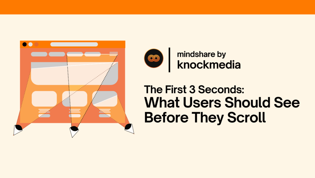
What Users Need to See Before They Scroll
1. Clarity: What Is This and Why Should I Care?
At a glance, users should understand what the page is offering and whether it applies to them. Strong headlines, a clear brand presence, and a short supporting description can help deliver this clarity.
Questions to consider:
- Is the value proposition obvious?
- Does the brand identity come through quickly?
- Would someone unfamiliar instantly grasp the purpose?
Simple language, clean layouts, and avoiding jargon help make this possible.
2. Visual Hierarchy: What Should I Pay Attention To First?
Good design doesn’t just look nice — it organizes information in a way that mirrors how people read and scan. Eye-tracking studies show that users make split-second decisions about where to focus based on size, placement, and contrast.
What helps:
- A headline that leads
- A supporting visual (like an illustration or photo)
- One clear call-to-action that appears without scrolling
Trying to say everything at once can backfire. The first screen should deliver one core idea, not five.
3. Trust: Can I Rely on This?
Even before a user processes content, they notice tone. Does this site feel current? Does it feel safe?
Trust is conveyed through the details:
- A clean, modern interface
- Consistent branding
- Recognizable logos or client names
- No broken links or unexpected pop-ups
It’s not about convincing users with long explanations — it’s about creating an environment that feels credible and polished.
4. Speed: Is This Going to Waste My Time?
A slow-loading site doesn’t just test patience, it damages trust. According to Google, as page load time goes from one to three seconds, the probability of bounce increases by 32%.
Optimized images, reduced scripts, and lightweight code can all improve performance. And in cases where loading is necessary, visual feedback, such as micro-interactions or loading animations, can help reassure users that something is happening.
Putting It All Together
Here’s a simplified version of what a strong “above the fold” section typically includes:
- Clear navigation
- A compelling headline
- A supporting image or video
- One call-to-action (like “Start Free Trial” or “See How It Works”)
- A few trust-building elements (such as testimonials or partner logos)
Designers often refer to early layouts like this as wireframes, a rough structure to test content hierarchy before diving into visual design.
A Real-World Example
One recent example comes from a homepage redesign for US Health Plan, created by Knockmedia. The design emphasizes clarity, guidance, and trust, delivering the brand’s value within the first screen. Users are introduced to the product, offered a clear path forward, and reassured with credibility indicators.
Final Thought: First Impressions Are Emotional
UX design isn’t just about usability, it’s about emotional clarity. The first few seconds of a digital experience lay the foundation for everything that follows.
Whether you’re a founder trying to improve engagement or a junior UX designer learning how to structure a page, remember this: most users won’t wait to understand you.
They need to feel that it’s worth it, fast.
Interested in learning how small changes to your homepage could lead to bigger results?
Contact us to explore how thoughtful UX strategy can improve the first impression – and everything after.